Hexbin Scatterplot - Support
Power BI custom visual by David Eldersveld
Contact me on Twitter - @dataveld
Log an Issue on GitHub
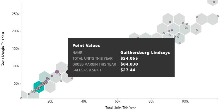
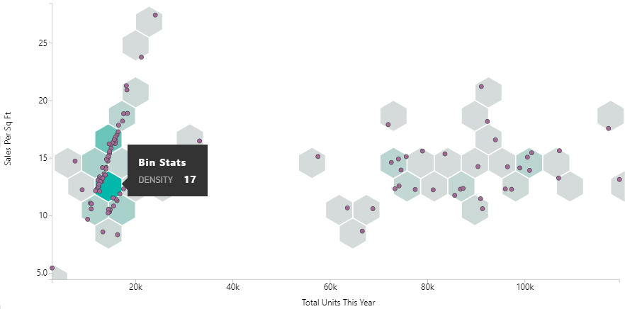
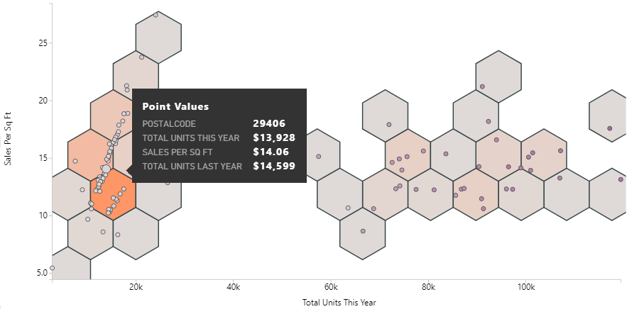
The Hexbin Scatterplot is a custom visual for Microsoft Power BI that displays points on top of hexagonal “bins”. Color saturation for the hexbins shows the density of points within each bin, with darker bins showing more points.
Functionality
- Hexbins - Add hexagonal bins behind the points of the scatterplot. Bins show the density of points using color, with darker bins representing more points in that bin.
- Points- View points in a cartesian plane.
Fields
The Image Timeline has options for four fields:
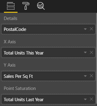
- Details - A required column containing individual data points.
- X Axis - A measure / numeric field representing values along the X axis.
- Y Axis - A measure / numeric field representing values along the Y axis.
- Point Saturation - An optional measure / numeric field that appears on tooltips and can also be used to show point color saturation, with darker color representing a higher measure value.
Format Options
There are several format options available to customize the scatterplot:
Hexbin Scatterplot Options
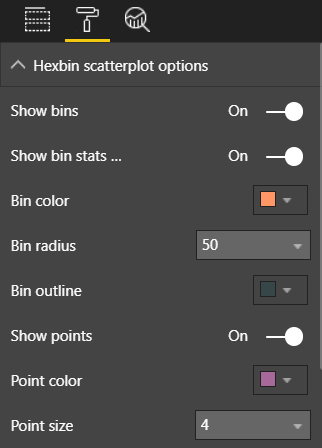
- Show bins - Show or hide hexbins on the scatterplot.
- Show bin stats on hover - Enable or disable the tooltip when hovering over a hexbin.
- Bin color - Alter the color of the hexbins. This color represents the darkest in the color scale and the highest point density.
- Bin radius - Alter the size of the hexbins, with options from 10 to 50.
- Bin outline - Alter the color of the hexbin outline.
- Show points - Show or hide points on the scatterplot.
- Point color - Control base color of points. If saturation is used, this color represents the darkest in the color scale.
- Point size - Control uniform size of points from 2 to 5 pixels.
Axes Options
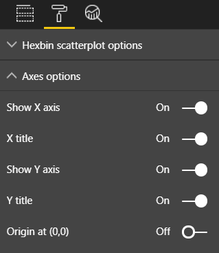
- Show X axis - Show or hide the X axis, ticks, and labels.
- X title - Show or hide the X axis title.
- Show Y axis - Show or hide the Y axis, ticks, and labels.
- Y title - Show or hide the Y axis title.
- Origin at (0,0) - Enable scatterplot to always start its grid at x = 0 and y = 0 (disabled by default).
Version History
1.1.0 - October 13, 2017
- Updated for new custom visual API version
- Additional format options
- Removed “rug” showing point distribution along axes
0.9.4
- Initial public release to Power BI Custom Visual Gallery
License
The Hexbin Scatterplot for Power BI is licensed under the MIT License.